Images can be an important part of email outreach, but it’s important to make sure that they’re accessible for all audiences. Below is a short guide on alt text, images with text and accessibility.
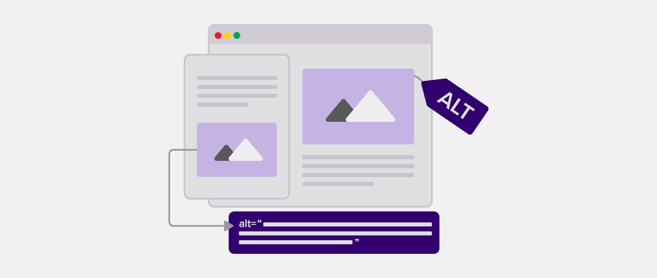
What is alt text?
Alt text is a critical part of email accessibility. Some cases are straightforward: an image of students, a campus building, or a faculty member typically needs descriptive alt text. But what about images that are mostly decorative, yet still include text, themes, motifs, or mood-setting details that readers may care about?
There are two main questions to consider
- Can I use an image with text in an email at all?
- If I do, how should I handle the alt text?
Our general rule has been to avoid images with baked-in text whenever possible. That is still best practice. But we also know that images with text are sometimes used for visual cohesion, tone, or emphasis. For example:
- A smiling pumpkin that says “Happy Halloween”
- Cherry blossom petals used to break up a spring newsletter
- A merch image with a “NEW” label
- An award image that identifies a winner
These images aren’t always essential, but they can affect how an email feels and how a message is received.
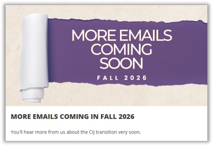
Short text in images may be acceptable when it adds mood, context, emphasis, or a small amount of useful content, like in some of the examples listed above. However, images with dense messaging, long text, or information that is not available anywhere else in the email should not be used. This includes things like event posters, course schedules, flyers, infographics, or anything else with heavy text.
Basically, if the information is important, it needs to appear in accessible body text or be recreated in an accessible email module.
The easiest way to think about this
Images with baked-in text are only acceptable when the text is short, meaningful, legible, and either supported by or repeated in the email body.
Also, keep legibility in mind! If you use an image with text, make sure the font is easy to read. Complex cursive fonts, decorative typefaces, low contrast, or awkward kerning can make the image inaccessible for many readers.
If an image is purely decorative (like a purple swirl to break up a section), it does not need descriptive alt text. In fact, the best practice is to null the alt text so that screen readers skip it entirely.
In Marketo, adding two quotation marks to the alt text field – “” – will void the image for most screen readers.
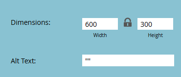
Don't forget the two quotation marks
Make sure you’re including the “” in the alt text box to “void” it completely!
Leaving the alt text field blank is not recommended, because some screen readers may read the image file name instead. These can be long, confusing, and often irrelevant, especially if generated automatically in lieu of alt text.
Some images are mostly decorative but include short amounts of text, like holiday greetings, award badges, celebration graphics, seasonal messages, etc.
These typically require a judgement call. For example, an image of a holly bush that says “Happy Holidays!” may not provide essential information, but it can make the email feel warmer or more festive for a December send. In that case, the image does contribute mood and context.
Since it affects the email, this should have descriptive alt text: “Festive holly leaves with the message ‘Happy Holidays’”
But if it is just decorative and doesn’t change the actual feel of the email, void it out.
You can test how a screen reader interprets your email using free tools like NVDA or the built-in Windows Narrator. To turn on Windows Narrator, press: Windows Key + CTRL + Enter
It is highly recommended to do this at least once so that you gain a better understanding of how assistive technologies convey information. It’s also a great way to figure out which alt text is skipped, described clearly, or incorrect.
When in doubt, ask what the image is doing for the reader. If you’re on the fence about it, it’s usually best to not include it (or void the alt text).
How to decide what kind of alt text an image needs
The ultimate rule
- Void the alt text with “” if it adds no context, meaning, mood, or navigation.
- Add alt text if the image contributes something meaningful to the reader’s understanding or experience of the email.
- Recreate the content in accessible text or modules if the image contains dense, important, or standalone information.